Thursday, October 21, 2010
Tuesday, October 19, 2010
Jewels Artisan Chocolate @ Orchard Central, Singapore
Presented with a design brief to create an up-market shop at Orchard Central, Nota Design International Pte Ltd has morphed Jewel’s artisan chocolate‘s flagship shop into one that stimulates visitors’ senses of taste and eyesight as much as their chocolates presented in delicious colors and decorations.
Concept
Design brief - To design an up-market chocolate boutique cafe in a shopping mall located at Orchard Road. The brief derived from the name 'Jewels artisan chocolate'. To offer the experience of viewing and selecting a crafted jewellery (in this case the chocolate) in this new flagship shop.
· Design challenges -
· the requirement of an enclose kitchen together with a chocolate making viewing area set the challenge for spatial planning as the mall management insisted that being an island shop space, the new shop implementation must not block the surrounding shops.
· The design of the display counters have to be different from the normal counters and have to become a draw in their own rights. The notion of the 'un-cut gem stones' were adopted in the design of the display counters.
· Design results
· The design of the shop have been well received by the client and the shoppers. The careful of material used for the display counters, the walls and the ceiling has created an interesting ensemble that not only embody the concept of crafted jewelleries but also echos the the status (high end image) of the brand.
Monday, October 18, 2010
Kimarie Saloon @ Orchard Central, Singapore
Location
Located at the 7th storey of Orchard Central, this new Kimarie hair saloon seeks to cater to a younger crowd in conjunction with the overall image the new shopping mall is creating, especially on this particular floor. This young and hip theme is identical to the earlier one that the developer has created at Far East Shopping Centre. Incidentally, the Youth Park which has over the years become a congregating node for the young and energetic is located just behind the new mall.
Concept
The new hair saloon design was set to break away from the other Kimarie branches. The idea to target the younger crowds has seamlessly fused with its location and surrounding activities such as the skate park and the graffiti walls.
The graffiti became a natural source of idea. With their bold, creative messages and graphics, the artists have transformed the otherwise plain looking concrete walls into colourful canvas. This idea was physically transformed into the shop front of the saloon. The Kimarie name is composed by the undulating glass panels and steel frames. The photo-mosaic prints were added on to create another layer of interesting texture that helps to enhance the wall chromatically and visually.
Yuwan restaurant wins DAS gold award
Our work in Shenyang winning DAS gold award. Team includes: Keat Ong, Gary Zeng, Zhigang Sun.
http://www.dasingapore.com/?p=877
http://www.dasingapore.com/?p=877
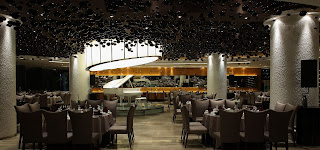
This is a design for a 5-star contemporary restaurant in Shenyang which serve western and eastern fusion delicacies.
The restaurant consists of a few important primary areas and programs namely, the Main Dinning Hall (with light stage), the Side Dinning Hall (with main stage), VIP Room 1, VIP Rom 2, VIP Room 3, Buffet Counters, Serving Counters, Seafood Counter, Entrance Hall (with waterscape features), Service Storage Zone and Kitchen Zone.
The Main focus of the interior architecture would have to be the Front of the Restaurant, frosted by a huge glass curtain wall. The triple volume space and full height glass curtain wall allow us to use inetrior design to contribute to the total architecture of the building. Recessed alcoves with red light shades are placed in a random yet orderly formation with black granite strips of different thickness as the main cladding materials.
The floor is divided into seperate programs, where dinning hall is decentralised. Natural scapes are introduced to help demarcate the zones without visusal blockades. More importantly, every public zones have their own special focal points and conversational pieces to ensure not only a gastronomic feast, but a visual feast for the dinners!
For a start, we wanted to draw the design back to its Chinese roots and at the same time, not look too "ethnical". A Contemporary Chinese design, that is. We utilized prominent "Chinese" colors like auspicous red and imperial yellow. Black and dark grey are utilized quite freely to contrast the pastel colors as well as to give the space an "up-market" feel. Wood elements are used to neutralized the contrast. For example, the weaved ball light shades, the rattan furnitures, the timber flooring and so on.
Sunday, October 17, 2010
Introduction to this Blog
hi first of all, KO keng Design means Keat Ong discusses Design. "keng" is a cantonese word by the way.
I own a design group of companies based in Singapore that practices master planning, architecture, interior design & occasionally, furniture design. We have offices around South East Asia & China. I invite design lovers from all around the world to join me in any discussions! If you have any questions regarding design, I will also try my best to answer you within my capacity!
I own a design group of companies based in Singapore that practices master planning, architecture, interior design & occasionally, furniture design. We have offices around South East Asia & China. I invite design lovers from all around the world to join me in any discussions! If you have any questions regarding design, I will also try my best to answer you within my capacity!
Subscribe to:
Comments (Atom)


